Laying out a furniture showroom: flow, vignettes, and focal points
Give customers a clear way into the store, a reason to explore, and room to try the furniture. Then test the layout against what actually happens on the floor.
The OrderPilot team·
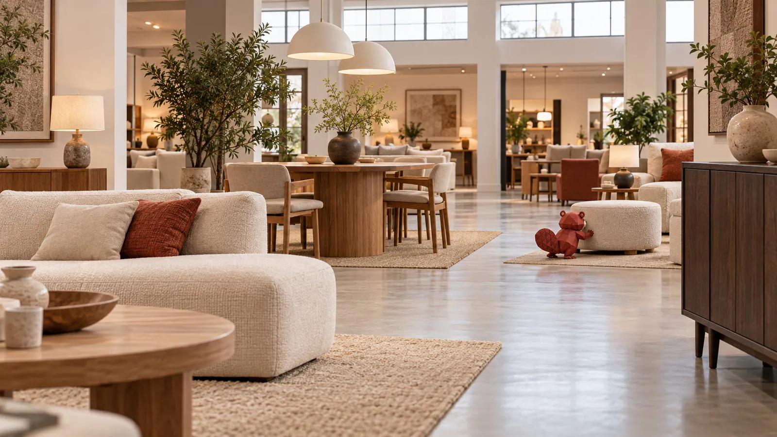
Stand just inside the showroom at 11 a.m. on Saturday. Watch where customers turn, which sofa gets the first sit, and whether anyone reaches the dining collection at the back. If the same console keeps sending people sideways, its vase may be beautifully styled, but the console has appointed itself traffic director.
A useful furniture showroom layout makes the next choice easy: where to walk, what to try, and where to ask for help. Begin with a clear entry and a legible route, then give the customer attractive destinations along it. The goal is a floor that helps someone choose furniture, not a route that makes them inspect every inch before they can leave.
Read the customer’s first minute before changing the entrance
Watch the first 60 seconds of several visits and record three things: the first pause, first direction, and first seat tried. Repeat the exercise during quiet and busy periods. A few short observation sessions give you something concrete to sketch around: where people enter easily, where they hesitate, and which displays draw them farther in.
Separate hesitation from interest. Someone stopping at the doorway may be admiring a room setting, looking for an associate, or searching for a path. Follow the next movement. A pause followed by a comfortable walk into the vignette tells a different story from a pause followed by a retreat toward the door.
Keep the arrival area free of anything that asks for attention before the customer has entered properly. That usually means removing stacked cartons, abandoned sample books, and a wall of competing offers. A greeting and a clear view into the store can do more useful work than another display stand in the doorway.
Give the entrance the breathing room its shape needs. A vestibule, a narrow shopfront, and a broad corner showroom call for different arrangements. The “first fifteen feet” is a useful merchandising prompt, not a fixed building dimension. The curb-appeal and entrance guide connects the view outside with the first useful view inside.
Position the greeter where help is easy to find and the route stays open. Home News Now’s Consumer Insights Now research includes customers asking for useful information without overly forceful attention. Let people take in the room, then be available when they want the dimensions, fabric book, or a second pair of eyes. Home News Now, October 14, 2022.
Choose a route that suits the shape of the building
A loop can make the showroom easy to understand when the building has enough width for a comfortable outward and return route. It gives departments a sequence and lets the customer see another destination before reaching a dead end. Keep cross-connections where practical so someone comparing dining chairs does not have to repeat the entire tour.
A free-flow plan can suit a smaller store or a collection of distinct rooms. The furniture sets define the route, so sight lines and clear openings matter more. From each setting, the customer should be able to identify another place to go. Free-flow should feel natural; it should not require a staff explanation of which gap is an aisle.
A grid works when comparison is central to the purchase. Rows of mattresses or occasional chairs can make differences easy to test. In a mixed showroom, a comparison area can sit within a softer overall route. There is no need to force the dining gallery and the mattress area to behave like the same department.
| Layout approach | Where it can help | What to watch |
|---|---|---|
| Loop | A broad showroom with several departments | Long compulsory detours and inaccessible shortcuts |
| Free-flow | Distinct room settings or an irregular footprint | Hidden exits from vignettes and ambiguous paths |
| Grid | Product comparison within a category | Repetitive views that hide the next destination |
| Main spine with side rooms | A long, narrow building | Dead ends, pinch points, and a back wall with no reason to visit |
In a long, narrow building with one public door, a clear main spine and short side routes may use the floor better than a full loop. Put a visible destination at the rear and leave places to step aside and compare products. Work the turning and passing space into the plan with the people reviewing the building’s access.
Size circulation for people and for the furniture you move
An accessible route’s legal minimum is not a complete showroom planning dimension. In the U.S. accessibility standards, §403.5.1 generally sets a 36-inch minimum clear width, subject to stated exceptions and the separate turning and passing provisions. That does not mean a 36-inch route provides comfortable side-by-side browsing or room to turn a sofa dolly. U.S. Access Board, Chapter 4, §§403.5.1–403.5.3.
For the operating width, test the actual loaded equipment and the actual route. Mark the proposed display edges and walk the delivery team through the tightest turn. Include handles, protective wrapping, furniture overhang, and the space staff need to work safely. A straight-line measurement between two table legs does not establish that a sofa can make the corner beyond them.
Customers also need to pull out a dining chair, try a recliner, and approach a seat. Check the usable space with those pieces in their working positions. If an open recliner blocks the only route, the floor plan depends on nobody trying the furniture as intended. That is a problem to solve before the display opens.
Keep accessible paths and emergency egress clear as displays change. Have building and accessibility professionals review the requirements for the premises and proposed alterations. The archived DOJ and SBA small-business guide, June 1999, provides background, and the accessible-showroom guide covers routes, counters, seating, and parking together.
Give each long view a destination
A focal point tells the customer why the next part of the store is worth visiting. At the end of a long view, show something that reads clearly from a distance: the silhouette of a dining table, a lit seating group, or a distinctive cabinet. It needs enough visual quiet around it to be understood before the customer reaches the price tag.
Look from the customer’s position. A tall sofa back can hide a carefully arranged room. A lamp can appear as glare against a window. Walk toward the setting from each likely approach and check what becomes visible first, including the path into it.
This illustrative sight-line sketch gives the store a near destination, a mid-store destination, and a rear destination. Follow the arrows as a customer would: each view offers a reason to take the next few steps.
                         Rear dining setting
                                ▲
                                │ clear long view
      Mid-store reading chair ◄─┼─► Design desk in view
                                │
                        Front seasonal setting
                                ▲
                              Entry
Lighting can distinguish a destination without making every display compete for attention. Check it from the route and from the seat where the customer examines upholstery. The showroom lighting guide covers layers and fabric color. A dramatic spotlight that misrepresents the linen is doing the selling conversation no favors.
A quiet corner is worth a closer look. Lowering a cabinet may reveal its entrance; moving a lamp may draw attention to the chair beside it. If the corner suits a quieter task, give it one, such as comparing finishes or spreading out a room plan. Match the job to the space customers can actually see and use.
Use room settings for imagination and category zones for comparison
A room vignette helps customers see how pieces relate. The sofa, rug, lamp, and side table should make sense together in scale and use. Leave room for the customer to sit and understand the arrangement. An attractive setting that cannot be entered becomes a picture to look at rather than furniture to consider.
A category zone helps someone compare what changes between products. Place competing chair shapes where their seat height, arms, and proportions can be understood without a long walk between them. The vignettes-versus-category-zones guide explores the balance; many stores need both kinds of space.
Prefer a complete explanation of a collection over a scattering of pieces that never shows what belongs together. That does not mean displaying every available item. Choose the pieces that demonstrate the design and the choices customers ask about, then make the additional sizes or configurations easy for an associate to explain.
Accessories should clarify the furniture rather than conceal it. A rug can establish the size of the seating group; a lamp can show how the chair might be used. Keep the arms, seat, extension mechanism, and finish available for inspection. The vignette-accessorizing guide addresses the supporting pieces without turning every surface into a storage shelf.
Use the floor-space-by-category method when a department keeps expanding by habit. Compare the space it occupies with the questions and sales it supports. A category that needs room for meaningful comparison deserves it; a collection that stays only because moving it is inconvenient needs a different argument.
Make price placement deliberate without hiding the range
The entrance should introduce the assortment with furniture the store is proud to sell. A useful opening price point can make the range approachable. Style it with the same care as the rest of the floor, and show how the customer can explore other sizes, materials, and price levels from there.
Likewise, the highest-priced piece is not automatically the wrong first display. It may represent the store perfectly. The question is whether that opening view explains the offer or makes customers assume everything is outside their budget. Observe the conversations it creates, and show a legible path to alternatives rather than treating price placement as a universal formula.
Put best-sellers where customers can find them and where they give others a reason to explore. A familiar collection can pull someone toward the rear; a clear sight line or sign can help the customer who came specifically for it. Test the position against the building and the requests associates hear.
Keep price information readable where the customer evaluates the piece. Describe the displayed configuration and distinguish it from a starting price when necessary. The furniture price-tag guide covers that conversation. An associate should not have to explain that the attractive price belongs to a different sofa after the customer has already imagined this one at home.
Give clearance a clear place and a clear explanation
Clearance and floor models can have a defined area without taking over the front of the store. Choose a destination that customers can find from the main route, keep the pieces presentable, and make condition and availability clear. The area should feel intentional rather than like the furniture that lost its place elsewhere.
A desirable floor model can also remain in a normal vignette with an accurate tag. Decide whether that serves the selling job better than moving it. In either case, replace the sold display thoughtfully so its departure does not leave a broken room setting or expose an unplanned shortcut through the floor.
Give receiving problems, incomplete pieces, and customer-owned goods their own holding spaces. The clearance area stays easier to shop when every piece in it has a clear sale position, condition description, and availability.
Make it comfortable to stay and easy to ask for help
Companion seating should be usable without interrupting the customer’s product trial. Someone accompanying the shopper may want to sit while fabric choices are discussed. Place that seat where the group can remain together and where a seated person does not block the route or disappear behind a display.
If you offer water, coffee, or a children’s area, make the operating responsibility explicit. Someone must keep the area tidy, manage spills, and preserve sight lines. Place drinks away from vulnerable samples, and do not create an unsupervised play space simply because an awkward corner is empty. A hospitality feature earns its space when the store can look after it.
The design desk should be visible enough that customers know the service exists, while giving a longer conversation some privacy. Near the front can work, but the doorway itself is rarely a comfortable place to spread a floor plan. Test noise, glare, sample access, and the route between the desk and the furniture.
Restrooms and the route to them affect the experience too. Keep the way clear and the room cared for, and review accessibility with the appropriate professional. Temperature, sound, and fragrance should support a comfortable visit; the showroom atmosphere guide covers those choices. More sensory input is not automatically more welcoming.
Draw a before-and-after plan before lifting a sofa
Start with a measured drawing of the building. Include doors and their swings, columns, fixed services, changes in level, counters, and routes that must remain clear. Then add furniture footprints and the space needed to use the furniture. Keep a version showing the current arrangement so the proposed improvement can be explained rather than imagined.
Here is an illustrative 12,000-square-foot showroom, shown in conceptual sketches rather than a scaled plan. Tall pieces near the entrance hide dining at the rear, and the design desk is hard to find. Opening the main view and adding cross-connections lets customers see more of the existing assortment.
BEFORE: illustrative 12,000-square-foot showroom
REAR   | Dining hidden behind tall cabinets | Design desk |
       | Isolated sofa sets | Dead end      | Spare chairs|
       | Tall cabinet wall | Narrow gap    | More sofas  |
FRONT  | Clearance stacks  | ENTRY         | Console row |
AFTER: same illustrative showroom; conceptual, not to scale
REAR | Dining focal setting ─── Clear return connection |
| Room settings │ Chair comparison area |
| Cross-connection ───┼── Cross-connection |
| Seasonal setting │ Visible design desk |
FRONT | Clear arrival ─── ENTRY ─── Companion seating |
Main view runs from entry toward rear dining.The proposed arrangement makes the floor easier to read: the rear dining setting is visible, room settings have clear entrances, and customers can find the design desk. After the move, observe those specific changes in use. The team can then see which parts work and where another adjustment would help.
Reset one zone at a time without closing the store
A weekend reset needs a sequence, a temporary holding area, and responsibility for reopening each zone. Move furniture outside customer hours where possible. Where work must happen during trading, keep customers out of the active moving area, preserve required access and egress, and have the team agree on safe handling rather than improvising around shoppers.
Use this full-text checklist as the reset plan; every item needs an owner before work begins:
- Measure and mark. Check the drawing against actual clearances and fixed features; have required access and building issues reviewed.
- Photograph the starting arrangement. Keep the viewpoints consistent so the team can compare what changed.
- Choose the first zone. Start where the move will open the route without forcing every other department into temporary storage.
- Prepare the holding area. Identify where displaced pieces can stand safely without becoming customer obstructions.
- Brief the moving team. Confirm equipment, lifting arrangements, fragile pieces, and the order of movement.
- Rebuild the setting. Position the major furniture before accessories, lighting adjustments, and tags.
- Walk and test. Try seats, doors, recliners, comparison routes, and the loaded movement route before reopening the zone.
- Restore selling information. Check prices, configuration details, sample locations, and staff knowledge.
- Reopen and observe. Record confusing turns or bottlenecks while they are fresh, then correct them.
Reopen each zone when the team has finished the move, restored access, and made the display ready to shop. If the next phase needs more room or time, schedule it outside trading hours. A completed zone gives customers a useful setting and staff a clear result to observe.
Measure whether more customers reach the back
Choose a rear boundary and count shopping parties who cross it, alongside all shopping parties entering during the same observation periods. Use the same definition before and after. Exclude staff and deliveries consistently. This gives you a reach rate with a denominator, rather than an impression that the rear department “felt busier.”
For example, suppose 20 of 100 shopping parties reached the rear before the change and 30 of 100 reached it afterward. In this illustrative calculation, rear reach rises from 20% to 30%, an increase of 10 percentage points. That tells the team more people used the route to the back.
Alongside reach, record whether customers sit, compare products, ask useful questions, and buy from the affected zone. Higher rear traffic is not enough if people walk through without understanding the assortment. Sales by zone also need context: a quotation started elsewhere may close beside the dining table, and a promotion may affect the result more than the route.
Use a six-week review period as a starting point, comparing similar trading days and time windows with the baseline. Note promotions, holidays, stock changes, and unusual events alongside the counts. Those notes help explain the result and make the next floor decision better informed.
Refresh vignettes when the selling story changes
Individual settings can change when samples sell, seasons shift, or a collection needs a clearer presentation. A whole-floor replan needs a stronger reason: repeated navigation problems, a changed category mix, unusable circulation, or evidence that important products remain unseen. Frequent movement is not useful if regular customers and staff can no longer find the pieces they came to compare.
Keep the main route recognizable while testing smaller changes. The floor-reset guide helps distinguish a restyle, a rotation, and a larger replan. Record what you changed and why, so the next reset starts with what the team learned rather than with the urge to make the showroom look different.
Layout belongs within the wider owner’s guide to running a furniture store: assortment, staffing, and follow-up still matter after the customer sits down. Start the next step with the showroom layout walk-through checklist, and take the route your customers actually take.
Sources
- ADA accessibility standards, Chapter 4: Accessible routes, §§403.5.1–403.5.3 — U.S. Access Board, 2010 standards
- ADA guide for small businesses — U.S. Department of Justice and U.S. Small Business Administration, fourth printing June 1999; archived guidance
- CIN research: Consumers want more help, information from retailers — Home News Now, reporting its Consumer Insights Now research, October 14, 2022
A useful floor plan makes the next choice easy: where to walk, what to try, and where to ask for help.