Making the quote request and portal pages look like your store
Carry your showroom's look into the quote request, confirmation, and customer portal, with clear buttons and useful words at each stop.
The OrderPilot team·
Your website has a hand-drawn logo, a warm off-white background, and a serif you paid a designer to choose. Then a shopper requests a quote and lands on a page that looks as though it belongs to a filing cabinet. The store has changed clothes halfway through the sale.
OrderPilot's customer-page styles let the quote request page, Request sent page, and portal share a recognizable look. Start with the brand kit, choose readable page styles, then write the confirmation and footer around the customer's next question. The result should feel like another room in your showroom.
Start with the store's identity
The brand kit in Settings › Branding supplies the visual starting point: logos, brand color, store name, and slogan. Use the same identity the customer has just seen on the website. A secondary mark can be useful in a smaller space, but the customer should not have to work out whether they are still dealing with you. Think about the whole journey while making that choice. A quote request leads to an email, a quote, and eventually an order page. The one-brand-look guide connects those pieces. Customer-page styling handles the web pages; email and PDF designs have their own editors and controls.
Choose the page styles customers actually read
Backgrounds, typography, corners, and buttons should make the furniture and the next action easy to understand. A light background can carry the store's warmth without reducing contrast. Buttons should be distinguishable from ordinary text. A quiet page still needs an obvious way forward.
The customer-page editors live in Settings › Branding. Their shared look covers the portal, quote request page, and Request sent page. You can use the published theme's fonts when OrderPilot can read them, or choose from the supported fonts. If the theme-font read needs approval or cannot identify a custom font setup, resolve that message or choose a supported alternative before judging the preview. CSS is optional. The ordinary controls cover the main decisions; scoped CSS is there for a designer finishing a specific detail. Keep those refinements small enough that your team can still recognize and maintain the page.
Match the page without flattening every brand
Customer-page layout settings are shared across the shop, rather than offering a separate full style preset for every location. On an order's portal page, the logo, contact details, and brand accent can follow the order's location and its brand. The general page background, fonts, corners, and buttons remain shared.
That distinction matters for a business with several showrooms. Choose a common page style that works with the brands you use, then preview an order from each relevant location. A location-specific phone number is helpful only if it belongs to the team who will answer the customer's question. The customer portal guide explains what customers can do once they arrive. Styling should support reviewing, signing, paying, and following an order without making those actions compete.
Give the confirmation message a useful job
The Request sent page should say the request arrived and explain what happens next. “Thank you for your interest” is polite, but it leaves the customer wondering whether to call the showroom.
Say your team reviews requests on showroom business days. A sample message could read: “We have your furniture choices. Our showroom team will review the specification and reply by the next business day. We'll contact you if we need a detail before preparing your quote.” Use that timing only if your team can keep it; it is an example service promise, not an OrderPilot response guarantee.
For the footer, useful content might be showroom hours and the best contact number. Keep the language brief enough to scan on a phone. The quote-request form guide covers what to ask before the customer reaches this page.
Preview the journey on desktop and phone
The previews help you catch awkward line breaks, weak contrast, and buttons that disappear into the background before saving. Review both desktop and phone views. A long store name or confirmation message can behave very differently once the page narrows. Use a sample journey for the final review: configure a chair, request its quote, read the confirmation, and open the portal. Notice whether the same store seems to be speaking at every stage. Keep the product-page options block in mind too; its styling is managed separately in Settings › Online store.
Before finishing, review the logo size, body text, button contrast, reply promise, and footer contact details. Then look at the quote PDF's branding so the document that follows the request feels familiar as well.
Return to choosing how your website sells custom furniture to make sure the page sequence matches the way your store handles the sale.
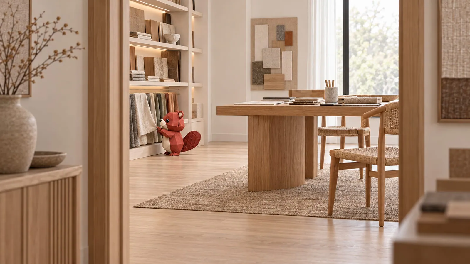
The request page should feel like another room in your showroom.