Room vignettes or category zones: choosing how to organize your furniture floor
Use room settings to show possibilities and category areas to make comparison easy. Give each part of the floor a clear job.
The OrderPilot team·
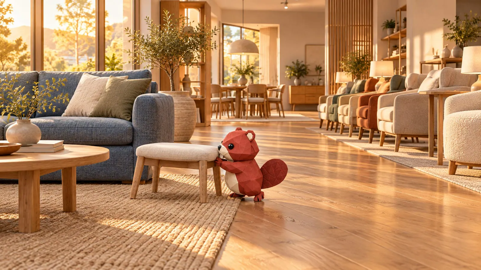
A customer asks to see “all your sectionals.” On a vignette floor, they are scattered through different rooms. On a category floor, they stand in a row, easy to compare but rather like vehicles awaiting their next owner. The customer wants to compare them and picture one at home.
Give the two jobs different places. Room vignettes show how furniture lives together; category zones make alternatives easy to inspect. A hybrid floor can use complete rooms at focal points and clear comparison runs between them. The right balance is a store decision to test, not a universal ratio of sofas to rugs.
This is practitioner guidance for making that choice. It does not claim that one layout has been independently proved to produce higher tickets. Start with showroom flow and focal points, then decide what the customer needs to do in each department.
Use a vignette when the customer needs to see a room
A vignette gives furniture context: a sofa's relationship to a chair, the size of a rug, where the reading lamp belongs, and how finishes sit together. It is particularly useful when the customer likes individual pieces but struggles to assemble them into a room.
Complete does not mean crowded. Keep the furniture available to try and make the principal relationships legible. If the coffee table prevents someone from sitting on the sofa, the room has become an exhibit. If the styling conceals the sofa's arms or scale, it is answering the wrong question.
Vignettes can also make related purchases easier to discuss. The customer can see why a particular side table or lamp works rather than hearing an unconnected suggestion at checkout. Use the whole-room selling guide to carry that visual relationship into a clear offer, with each included piece identified.
The costs are space and maintenance. Styled rooms need enough breathing room to be understood, and sold accessories need replacement or a deliberate restyle. A missing lamp can leave a composition oddly unfinished. Comparison is also harder when similar frames are separated, so the associate needs a simple route between them.
Use a category zone when the customer needs to compare
A category zone brings alternatives together so the customer can test a difference. Recliner mechanisms, mattress feels, dining-chair comfort, and sofa seat depths are easier to compare when the next option is close enough to revisit without a tour of the building.
Give the comparison a structure. Group by a useful buying question, such as scale, function, or a clear price ladder, rather than the order in which the truck delivered the pieces. Keep enough room for a chair to pull out or a recliner to operate. Density that prevents the product from being used is false efficiency.
Category presentation does not have to feel like a warehouse. Consistent tags, a calm background, adequate light, and small moments of styling can preserve a premium experience. Show what differs between products instead of leaving the customer to infer quality from the price alone.
Zones do not inherently cause haggling. They make prices easier to compare, which exposes an unclear price ladder. If staff cannot explain why the more expensive chair costs more, a discount request is an understandable response to missing information. Improve the explanation before blaming the arrangement.
Choose the hybrid by the buying task
Use room anchors to establish the store's point of view, then connect them with focused comparison areas. The customer should be able to move from “I like that room” to “Which of these seats suits me?” and back again without losing their bearings.
| Layout | Best job | Main operating cost | Watch during a test |
|---|---|---|---|
| Room vignettes | Showing scale, coordination, and a complete idea | Space, styling, and replacement pieces | Related-item orders and useful design conversations |
| Category zones | Comparing feel, function, size, or price | Clear grouping and disciplined presentation | Comparison ease and department productivity |
| Hybrid | Connecting inspiration with selection | Maintaining a readable route between the two | Both comparison success and multi-piece orders |
An illustrative hybrid can look like this:
ENTRY → living-room anchor → sofa comparison run
  ↑                                ↓
dining anchor ← chair comparison ← fabric library
  ↓
bedroom anchor → mattress zone → consultation
The drawing is a relationship sketch, not a measured plan. Preserve the building's actual access and circulation needs. A route that looks elegant on paper still needs to work with doors, columns, and furniture in use.
Mattresses and recliners often suit comparison zones because feel and function invite repeated testing. Living and dining collections often benefit from a room setting. Those are starting judgments, not rules: a compact apartment vignette might be the best place to explain a small recliner, while a dining-chair wall can solve a comparison problem beautifully.
Fit the mix to the store's customer and assortment
A premium, designer-heavy showroom may give more space to distinctive room anchors, complete materials, and consultation. A mid-price family store may need more direct comparison and clearer total prices. Both customers still need access to the product and a believable way to picture it at home.
For made-to-order frames, place the fabric library where it connects the display and the working table. Customers should be able to carry a sample back to the actual sofa under comparable light. A beautiful swatch wall at the opposite end of the store becomes less useful each time an associate has to leave the conversation to retrieve a book.
Stock-led departments need the displayed configurations and available alternatives to be unmistakable. Custom-led departments need the sample frame to explain the options it represents. Use the floor-it-or-sell-it-from-the-book guide to decide which physical samples earn the space.
There is no defensible fixed number of complete rooms that makes a 10,000-square-foot store feel design-led. In a test, the owner might begin with three strong anchors rather than many incomplete rooms, then allocate the remaining area to comparison, samples, consultation, and circulation. The right count follows the usable plan and the assortment, not the building's headline area alone.
Test one department with the measures defined first
Try an eight-week experiment in one department, keeping the rest of the floor stable where possible. Record the previous layout, occupied area, samples, prices, promotions, and staffing. Decide what problem the change is meant to solve: difficult comparisons, weak related-piece sales, or an area customers seldom enter.
Track multi-piece tickets using a definition written before the test. For example, count orders containing a sofa plus a separate related furniture piece, and report them as a share of orders containing sofas. Decide whether accessories qualify and use the same rule before and after. Count an order once even if it contains several qualifying pieces.
Say the earlier period had 40 sofa orders, of which 10 included a related furniture piece: 25%. During the test, 14 of 42 did: about 33%. That is an encouraging observation to investigate, not proof that the layout alone caused the change. Review traffic, product availability, promotions, and the associates working each period.
Measure department revenue or contribution per square foot using the same time period and area definition. Include special orders generated from the sample where attribution is reliable. See floor space by category for allocation, and average-ticket measures for reading order size without confusing it with profit.
Keep what helps customers make the decision
Listen to the floor team during the experiment. Did customers find the alternatives? Could they return to the first seat easily? Did the styled room help explain the rug or table, or did it merely collect compliments? Record these observations alongside the numbers so a low-volume period still produces useful learning.
At the review, keep the arrangement if it improves the intended job without creating a worse one. Revise it if room inspiration improved but comparison became awkward. Reverse it if the evidence and everyday experience do not support the space it consumes. A layout is working furniture, not a permanent statement of the owner's taste.
Start the next test with the showroom flow guide, choosing one route that lets a customer imagine the room and then compare the pieces with confidence.
Give inspiration and comparison a place of their own, then make the route between them obvious.