Swatches and finish choices customers can actually see
Give each choice a useful picture and a plain label, then keep the vendor's identifier behind the customer's selection.
The OrderPilot team·

“Is Fog the gray one or the blue one?” In a dropdown, Fog, Mist, and Harbor are weather reports. Beside accurate swatches and clear labels, they become choices a customer can discuss.
Give fabric and finish values a picture, a customer-facing name, and an unambiguous internal identity. OrderPilot supports color swatches, value images, and online presentation choices. The aim is to help the customer recognize the material while preserving the detail purchasing needs.
What should every fabric value contain?
Pair the vendor's identifier with a label the customer understands. In an illustrative entry, internal code AN-4471 can carry the customer label Fog linen. Retain the code rather than replacing it with a poetic name that another vendor also uses. The label helps the conversation; the identifier settles which cloth to order.
Use a Swatch option for colors and value images for the actual material's appearance. A flat color is useful for a simple distinction, but it can't show a boucle's loops or a linen's weave. The product-template guide explains how these choices remain attached to the configured piece.
A short value description can carry verified fiber or care information. Online Image cards and Radio list looks can display that sentence. Use the maker's actual care instruction; the cleaning-code explainer helps staff understand the distinction before condensing it into a label.
Which online presentation makes the choice clearer?
Choose the look around the material. Color swatches suit simple color choices. Image swatches show texture. Image cards allow more space for a picture and its description. Set the shared option's look, then use a template-specific presentation where a particular product needs it.
Baymard's research on visual filters explains why pictures beside text help people interpret visually distinct attributes. That finding supports a practical habit here: show the difference the customer is being asked to choose, rather than relying on the customer to know your terminology.
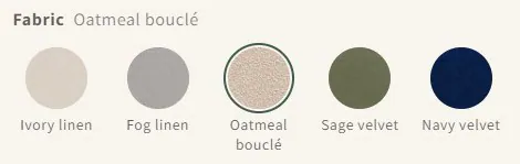
Check the result at the size your customers actually use. A tightly cropped weave can become a vague patch when reduced. Keep the chosen value's name easy to find, and use always-visible names when similar-looking fabrics need a verbal distinction.
Do the same color chips appear on the iPad?
Plan the POS conversation around its value grid or searchable list. Don't promise that the website's color-chip presentation appears identically on the iPad. Staff can use the physical swatch book alongside clear catalog labels, then record the exact chosen value.
Customer-facing labels also appear in quotes and PDFs. Review a sample quote after renaming or presenting an option: the customer should recognize the choice they made beside the swatch book, without receiving a string of unexplained vendor codes.
How can an existing finish library be reused?
The Admin order desk's Designer and Finishes picker can use mapped Shopify metaobject entries with a thumbnail and label. Those entries also supply the product spec sheet's finish library. It suits a store that already maintains a structured finish collection rather than a separate folder of loosely named pictures.
Use Hide online for a staff-only option. Review its default and required behavior before hiding it, so a customer isn't left with a configuration that needs an answer they cannot provide. Keep the ordinary customer choices visible and understandable.
How large should the swatch image be?
Use enough source detail for the largest place the image will appear, then inspect the actual result. There isn't a single Journal-approved pixel size that suits every swatch and card. Look for a recognizable weave, a clean crop, and no blur at the intended display size.
Photograph or scan samples under consistent light and with consistent framing. Include a ruler in the reference capture when scale matters, and keep a clean customer crop. Compare the material image with the product photography: Baymard's furniture study recorded hesitation when those representations disagreed.
Screens and natural materials vary. Use a sample program when the customer needs to judge a finish beside their flooring, and explain why wood differs from a finish sample. A useful image starts the decision; a real sample can finish it.
Sources
- Furniture and home decor UX research — Baymard Institute, December 12, 2024. Original research discussing material information and inconsistent swatches.
- Use visual filters for visually distinct product attributes — Baymard Institute, July 9, 2024. Original usability research on pairing images with labels.
The label helps the conversation. The identifier settles which cloth to order.