Branding settings
Related guides
- Set up your brand kitBranding · 6 min
- Style each customer pageBranding · 5 min
- Edit and publish your email designsEmails and messages · 5 min
- Create email templates and assign brand designsEmails and messages · 4 min
- Print and brand POS receiptsShowroom (POS) · 5 min
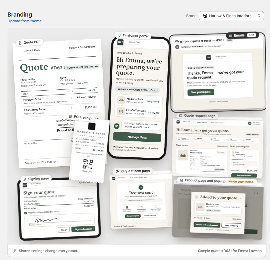
Find Branding controls by asset, including which values are shared and which affect one page. The page covers 8 customer-facing assets.
Start with Set up your brand kit for the main setup sequence. This reference helps you locate a particular field.
Before you start
Branding needs Manage shop settings. Saving product-page storefront styling also needs Manage order and quote settings.
The page edits the same settings used by Business details, customer-page controls, Online store styling, PDF themes and email settings. These are shared settings, not independent copies.
One Save bar covers the Branding draft. Check the affected previews before saving a shared field.
Header and brand kit
| Control | Effect |
|---|---|
| Brand picker | Selects the brand when grouping is enabled. Save or discard changes before switching. |
| Update from theme | Compares available theme values and lets you choose which to copy. |
| Apply this look to all assets | Copies supported look settings to selected assets. Email drafts still need publishing. |
| Logo | Uses one uploaded image framed as a logo and square mark. |
| Logo position | Left, Center or Right on supported assets; each keeps its own position. |
| Brand colour | Shared brand color, used according to the asset's help. |
| Accent colour | Shared accent where the asset supports it. |
| Store name | Required store identity. |
| Slogan | Optional shared wording. |
All assets shows previews from the current draft. Open a card for its editor or use Open in new tab for a temporary sample preview.
Portal and request pages start with a left-aligned logo; POS receipt starts centered. Quote PDF, signing and emails control placement through their document or header design.
Quote PDF
Document tabs are Sales order, Invoice, Purchase order and Spec sheet. Quotes, orders and signing use the Sales order theme.
| Design field | Choices or purpose |
|---|---|
| Heading font | Document heading typeface. |
| Body font | Document body typeface. |
| Heading emphasis | Regular, Semibold, Bold. |
| Text size | Small, Medium, Large. |
| Spacing | Compact, Regular, Wide. |
| Reset design settings | Returns the design controls to their defaults. |
After Design, the editor includes Document blocks and Lines. For Spec sheet, the line section is Product information.
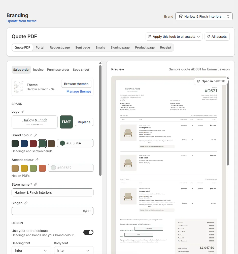
Brand color applies to headings and section bands. Accent color is not used on PDFs.
PDF-theme controls are unavailable when that feature is not enabled. See Quote and order PDFs for document use.
Customer portal and request pages
These 3 assets share fonts, corners, buttons, background and customer-page CSS. Their content and logo positions remain separate.
| Field | Asset and limit |
|---|---|
| Fonts | Shared customer-page font choice. |
| Corners | Square, Rounded or Pill. |
| Buttons | Filled or Outline. |
| Background | A light color that preserves 4.5:1 contrast for the portal's gray text. |
| Footer message | Portal account page; 500 characters. |
| Show your store's header and footer | Quote-request and Request sent pages. |
| Thank-you message | Request sent page; 300 characters. |
| Custom CSS | Shared across all 3 pages; 20 KB. |
| Logo position | Each page independently; initially Left. |
For setup, see Style customer pages. Portal availability is controlled separately under Customers settings.
Emails
The Emails asset contains email groups, template rows, publication badges, New group, New template and Default email theme.
Use Edit and publish emails for changes and publication. Email templates and brands covers reusable and brand-specific designs.
Emails use the shared logo and brand color. Applying a look does not publish a template automatically.
Signing page
| Field | Effect |
|---|---|
| Same as the Quote PDF | Uses the Sales order theme when on, or customer-page fonts around the document when off. |
| Buttons | Sets the surrounding signing controls' appearance. |
| Agreement line | Adds up to 200 characters before the standard agreement, which remains. |
The displayed document remains the Sales order PDF. Its logo placement belongs to that document's theme.
Product page and pop-up
| Field | Choices or limit |
|---|---|
| Corners | Square, Rounded, Pill. |
| Buttons | Filled, Outline. |
| Swatch size | Small, Medium, Large. |
| Selected ring | Thin or Thick. |
| Gap | Tight, Normal, Roomy. |
| Pop-up title | Up to 60 characters. |
Product-page fonts and text color come from the theme. Online store's explicit accent takes precedence over the shared brand color.
Use Style the options block for the related fields, CSS and theme hooks.
POS receipt
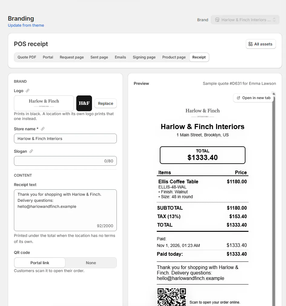
| Field | Effect |
|---|---|
| Receipt text | Up to 2,000 characters, printed below the total when the location has no terms of its own. |
| QR code | Portal link or None. Portal link needs customer portal access enabled. |
| Logo position | Left, Center or Right; initially Center. |
| Logo | Prints in black. A location-specific logo takes precedence. |
See POS receipts for printing and location-specific behavior.
If something goes wrong
Brand picker is greyed out
Save or discard current changes first.
Quote PDF controls are greyed out
Read the PDF-theme availability reason.
Portal link is unavailable for the QR code
Enable customer access under SettingsCustomersPortal access.
Receipt settings could not be loaded
Choose Try again.
A background is refused
Choose a lighter color that meets the text-contrast requirement.
Was this guide helpful?
Thanks. Tell us what was missing at support@meetorderpilot.com.