Set up your brand kit
Related guides
- Style each customer pageBranding · 5 min
- Branding settingsBranding · 4 min
- Edit and publish your email designsEmails and messages · 5 min
- Group locations into brandsSettings and integrations · 3 min
- Print and brand POS receiptsShowroom (POS) · 5 min
The brand kit holds the shared visual identity used across your customer-facing pages and documents. It includes your logo, colors and store name, so you can manage those details together.
Each page or document also has its own supported layout and presentation settings. A shared-field icon explains when changing a value affects every asset.
Preview the affected pages and documents before saving. If your business has separate trading names, brand grouping organizes their locations.
Before you start
Check access
Branding needs Manage shop settings.
Prepare your logo
Use PNG, JPG, SVG or WebP under 5 MB.
Know what is shared
The kit contains the logo, square mark, brand color, accent color, store name and slogan.
Branding contains Quote PDF, Customer portal, Quote request page, Request sent page, Emails, Signing page, Product page and pop-up, and POS receipt.
All assets shows preview cards. Click a card to open its editor; one Save bar covers the changes across Branding.
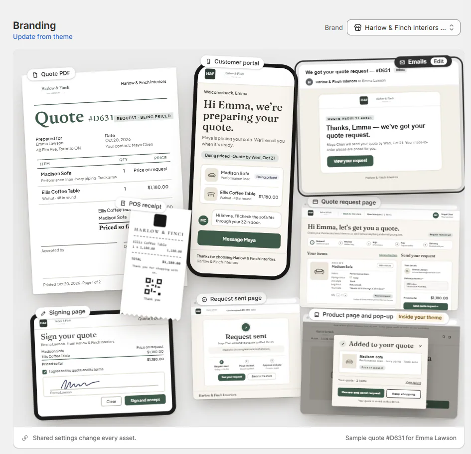
Open in new tab previews the unsaved draft with sample data and a Sample banner. Its link lasts 15 minutes.
Emails use the kit's logo and brand color. Quote PDF customization requires PDF themes; unavailable controls explain that requirement.
Set the shared brand kit
Step 1: Open the Brand section
Open SettingsBrandingCustomer portal and find Brand.
The section shows the shared fields. Hover the share icon to read Shared: changes every asset.
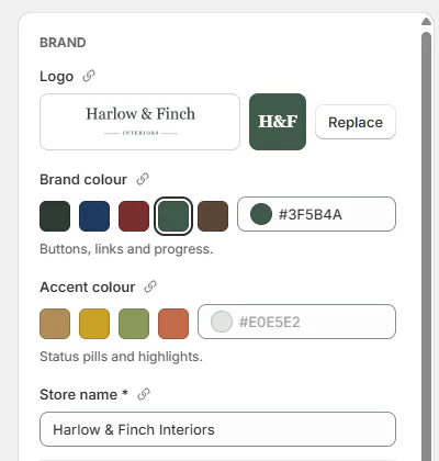
The logo, square mark, colours and store name are shared by every asset. Step 2: Upload and frame the logo
Click Logo and choose the image. In Frame your logo, drag to position it and adjust Zoom.
Switch between Logo and Square mark. The previews show the wide logo and the square version used where space is limited.
Use Use another image if the square mark needs a different source. Use the logo's image returns it to the shared source.
Click Apply once the image finishes loading. The draft previews show the framed logo.
Step 3: Choose colors and wording
Set Brand colour and Accent colour. Choose a supplied swatch or enter your store's color.
Enter the required Store name and optional Slogan. The asset previews update as you edit.
Brand swatches include Harbor green, Navy, Oxblood, Pine and Walnut. Accent swatches include Brass, Gold, Sage and Clay.
These are shared changes. Check more than the currently open asset before saving a new logo or color.
Step 4: Set an asset's logo position
On Customer portal, Quote request page, Request sent page or POS receipt, choose Logo position: Left, Center or Right.
This setting affects that asset only. The receipt starts centered; those customer pages start left-aligned.
On wider customer pages, Center places the logo and name above the header bar. Right places them at the bar's end from 768 px wide.
You can also click a home card's logo for its position and framing popover. The Product page card has no logo spot.
Logo controls from All assets
Step 5: Save the kit
Review the affected asset previews and use the Save bar. The saved kit becomes the source for those customer assets.
Quote PDF placement belongs to its PDF theme. Signing uses the quote PDF's logo placement; email placement belongs to each email's header block.
Brand color and logo precedence
Where the brand color appears
The color is used for portal buttons, links and progress; email buttons, links and the current step; and signing buttons and ticks, including POS signing. Online options, pop-ups and the quote cart use it when no Online store accent is set.
A color too light for white text is darkened for contrast. Without a saved color, the default is green.
With brand grouping, use the Brand picker or brand editor for that brand's color. Save or discard changes before switching brands.
The POS receipt prints its square mark in black. A location's own logo takes precedence.
Update from the Shopify theme
Step 1: Compare available theme values
Choose Update from theme in Branding. Compare Setting with From your theme.
Values you previously set yourself start unticked. The dialog presents the changes without applying them.
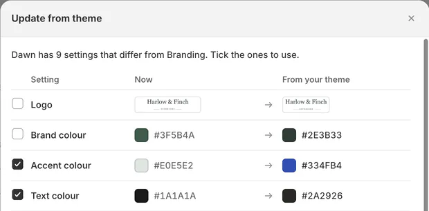
Tick the theme values to copy; values you set yourself start unticked. Step 2: Choose and save the updates
Tick the settings you want and click Use these. Review the resulting previews, then save.
Nothing changes until you save. Email templates and PDF themes are not replaced by this import.
A new installation fills empty or default kit fields from the theme once. Older stores keep their appearance until someone chooses Update from theme.
OrderPilot does not continually re-read the theme. Repeat this comparison when you intentionally want later theme changes.
Choose fonts and share a look
Step 1: Choose the portal fonts
Open Customer portal > Look > Fonts. Choose Your theme's, OrderPilot or Custom. Your theme's reads the fonts from your live theme when you save.
OrderPilot fonts are Fraunces and Plus Jakarta Sans. Custom provides Heading font and Body font for your selected Google Fonts.
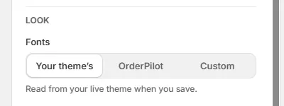
Your theme's reads the fonts from your live theme when you save. Use Refresh fonts after changing the theme's fonts. Check any warning before assuming the new pair was read successfully.
Step 2: Select other assets
Choose Apply this look to all assets. Tick the assets that should receive it, or use Select all.
It copies the fonts, corners, buttons and background; a row already using them says Matches. Click Apply to N assets, then save. The compatible asset previews show the copied look.
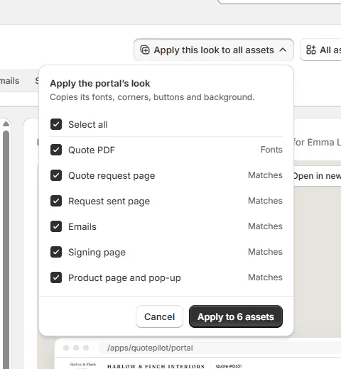
Apply this look menu with assets ticked The POS receipt is never listed. Its printing controls remain separate.
Step 3: Publish affected emails
Open the affected email templates and review their drafts. Publish each through Edit and publish emails.
Emails use an email-safe font: a serif maps to Georgia, otherwise System. The copied look also sets button corners.
Warning
Applying a look changes email drafts only. Customers keep receiving published designs until those drafts are published.
What happens next
Shared previews update during editing, and saved customer assets use the kit. An older published email can show Live · publish again after a brand-color change.
Publish it again to use that color. A successful Branding save does not itself publish an email design.
For individual-page controls, continue with Style customer pages. Branding settings lists fields by asset.
Example: Harlow and Finch's look
Example · Harlow & Finch Interiors
Share the kit and finish the email
Nora Ellis prepares Harlow & Finch Interiors' branding.
- Upload its wordmark and frame the square mark.
- Choose Harbor green, Brass and the store name.
- Use the theme's fonts on the customer portal.
- Apply the look to the compatible assets and save.
- Keep the portal logo left-aligned and center the receipt logo.
- Publish the updated Quote email.
Olivia Bennett's next quote uses the published design with the store's brand color.
If something goes wrong
The image is refused
Use a supported format under 5 MB.
Apply is waiting
Let the logo finish loading, or upload the file when it cannot be framed from its current source.
The theme cannot be read
Use Try again and follow any permission-approval message.
Theme fonts cannot be identified
Choose custom or OrderPilot fonts, then refresh when the theme is readable.
Apply this look is greyed out
Read the compatibility reason and tick at least 1 supported asset.
Emails did not change
Review and publish their drafts.
PDF controls are unavailable
PDF themes are not enabled for this store.
Was this guide helpful?
Thanks. Tell us what was missing at support@meetorderpilot.com.