Style the options block with your theme and CSS
Related guides
- Set up your theme for OrderPilotOnline store · 6 min
- Style each customer pageBranding · 5 min
- Set up your brand kitBranding · 6 min
- Fine-tune how options look and behave onlineOnline store · 6 min
- Online store settingsOnline store · 3 min
Match the options block to your theme with shared style fields or scoped CSS. Theme developers can also use the block's documented classes, variables and events.
These controls affect the product-page options. Customer-portal and quote-request-page styling has a separate place in Branding.
Before you start
Prepare the storefront
Complete Set up your theme.
Check access
Online store settings need Manage order and quote settings.
Check related branding
Product page and pop-up in Branding edits the same look and also controls selected-ring thickness and button fill.
See Style customer pages for the Branding presets. Avoid changing both areas without checking which saved appearance you intend.
Customize the shared style
Step 1: Open the style controls
Go to SettingsOnline storeStyle of the options block. Choose Customize style.
The card shows the 6 fields. A blank field uses the theme's style.
Step 2: Set the needed values
Choose values only where the theme needs an override.
Field Controls Accent Highlight color. Corners Corner radius. Space between options Vertical spacing between choices. Swatch size Size of swatch controls. Borders Border styling. Selected option outline Outline color for the selected choice. Click Save in the save bar. The store configuration is republished for product pages.
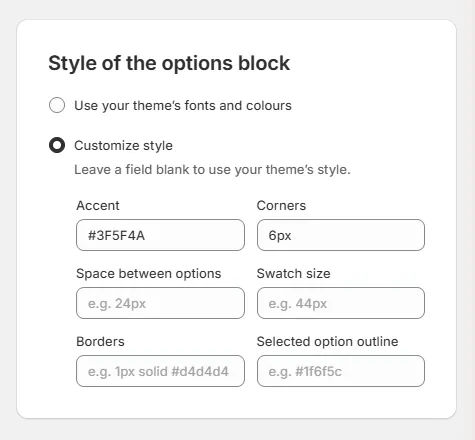
Style of the options block with Customize style open and the six fields With no explicit accent and a brand color in Branding, the block uses that brand color.
Step 3: Return to theme styling
Choose Use your theme's fonts and colours and save when the theme should supply the appearance.
Check the product page after publication and caching. The saved setting now requests the theme's fonts and colors.
Add custom CSS
Step 1: Open the CSS field
Go to SettingsOnline storeCustom CSS. Enter rules for the options block, up to 20,000 characters.
For example, this rule adjusts the value-control corners:
``
css .op-value { border-radius: 8px; }``The app wraps the rules in a scope limited to the options block.
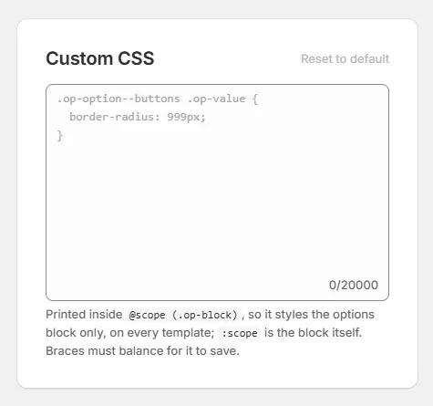
Custom CSS card with its example rule shown as a placeholder Step 2: Save and check the result
Save, then inspect the intended control on the product page. Resolve any validation message before expecting the new style to appear.
A browser without CSS scope support skips these rules. Use the shared style fields for changes that should not depend on custom CSS.
Step 3: Clear the custom rules
Choose Reset to default to clear the CSS field. Save the change.
When the field is already empty, the reset control explains there is no custom CSS to reset.
This field is separate from customer-page CSS under Branding. Changing one does not clear the other.
Use classes, variables and events
Step 1: Open the reference
Go to SettingsOnline storeClass names and events. Give this reference to the person maintaining your theme.
It lists the supported names for the block and its controls.
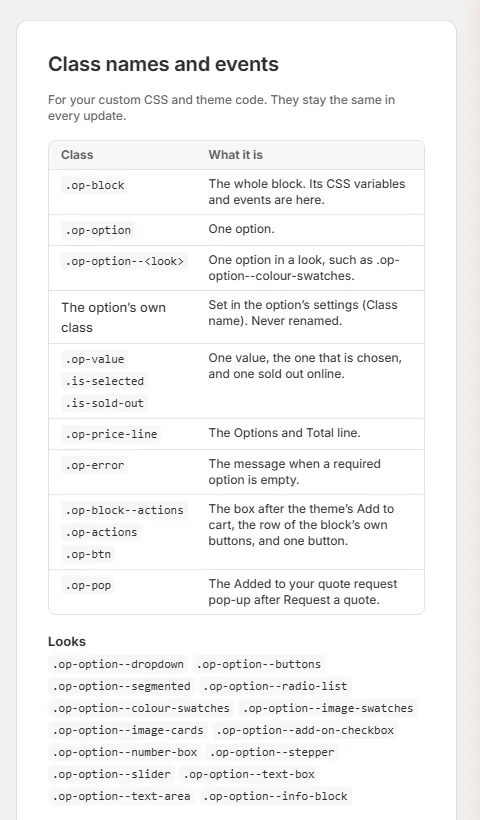
Class names and events card Step 2: Choose a stable class
Use the class for the specific element being styled.
Class Element .op-blockOptions block. .op-optionOne option. .op-option--<look>An option with a particular look. Option's own class The Class name set on the shared option. .op-valueA value control. .is-selected,.is-sold-outSelection and availability states. .op-price-line,.op-errorPrice summary and error. .op-block--actions,.op-actionsAction areas. .op-btn,.op-popButtons and pop-up. Use option-specific class names for a choice needing a distinct style.
Step 3: Use variables for shared appearance
The variables are
--op-accent,--op-radius,--op-gap,--op-swatch-size,--op-border,--op-selected-ring,--op-ring-widthand--op-button-fill.Defaults are declared within
:where(.op-block). Button fill uses 100% for filled styling and 0% for an outline.Branding's Selected ring and Buttons controls set ring width and button fill.
Step 4: Respond to supported events
Use events when the theme needs to react to configuration or quote-cart changes.
Event Timing and detail op:changeFirst render and every change; detail contains cfgandunitPrice.op:validInitial valid state or the line becoming complete. op:invalidInitial incomplete state or the line becoming incomplete. op:quote-addedAfter a quote line is added and before the pop-up opens; detail contains lineandpieces.Configuration and price are null while the line is incomplete. The quote-added event can be canceled to suppress the standard pop-up.
What happens next
The shop configuration republishes after a save. Shopify's cache can delay the product-page result.
A style change does not alter prices or required choices. Check appearance and the customer interaction separately.
Example: showroom styling
Harlow & Finch Interiors chooses its green accent and rounded corners. The product options then match the store's visual treatment.
Its theme developer handles op:quote-added and calls preventDefault() when opening the theme's own quote drawer instead of the standard pop-up.
The line has already been added at that point; canceling the event suppresses the pop-up, not the quote-cart addition.
If something goes wrong
A color is refused
Use a valid value such as #1f6f5c or rgb(31, 111, 92).
A border is refused
Use a valid border such as 1px solid #d4d4d4, or none.
A size is refused
Use a length such as 8px, 0.5rem or 0.
CSS will not save
Check unclosed braces, comments, quotes and invalid URLs against the displayed message.
A saved change is not visible
Check publication and caching before repeating it.
Branding presets and Online store style fields edit the same saved style. Branding displays the nearest preset for a custom value.
Choosing an equivalent preset keeps that custom value. Changing the preset deliberately replaces the corresponding style setting when saved.
Was this guide helpful?
Thanks. Tell us what was missing at support@meetorderpilot.com.